BRAND IDENTITY, ILLUSTRATION, PACKAGING DESIGN
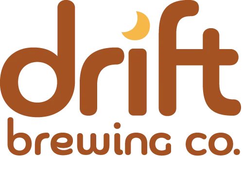
Drift Brewing Co. Brand Identity
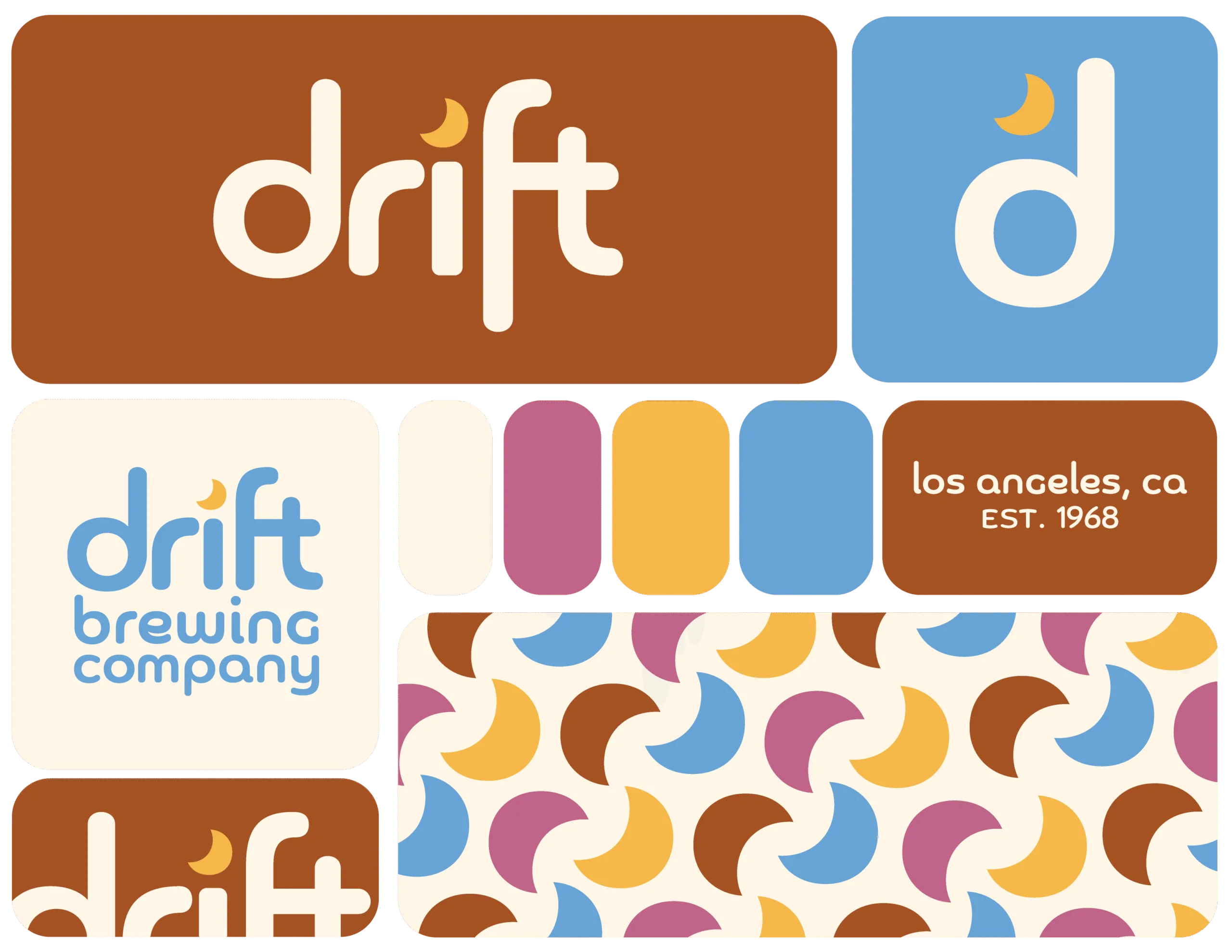
Created as a part of the Briefbox bootcamp, this brand & packaging identity for a fictional brewery takes its inspiration from SoCal skate culture. Using a mixture of graphic design and illustration, I created a unique and refreshing brand identity for Drift.
As the birthplace, and a bastion of the sport and subculture ever since, California and LA specifically are synonymous with skateboarding. This unique sport has its own fashion, style, and aesthetic, with ties to the punk and DIY communities. The skate community is welcoming to all, and skaters of all levels are known for their perseverance to try over and over again to land a single complicated trick.
Like brewing that perfect sip, skateboarding takes craft, dedication, and skill.
Client
Self-directed, Briefbox
Scope
Brand Development
Logo Design
Overall Brand Identity
Packaging & Merchandise Design
Brand Identity
By adjusting the font Chennai, I created the Drift wordmark, choosing to keep it lowercase and laidback. With some further stylizing, the wordmark emulates the iconic skate brands of the SoCal area.
I also replaced the tiddle of the i with a moon, harkening back to the name of the brand itself, as the moon controls the tides, which might cause you to drift away.
Label Designs
As I was provided the names of the individual brews as well as some details of the brew itself, I wanted to challenge myself to create illustrations with a minimal palette, incorporating only the established brand colours. Primarily drawn in Procreate, I added the finishing touches to the illustrations and labels in Photoshop to add some depth and texture to them.
I kept the back labels simple, to give the illustrations space to shine as the stars of the show.
I also designed some simple coasters to go alongside the beer bottles, likely as a freebie.


