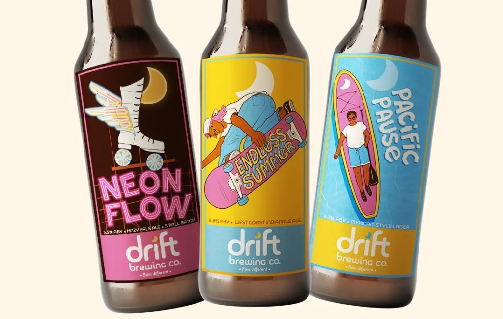
Drift Brewing Brand Identity

Created as a part of the Briefbox bootcamp, this brand & packaging identity for a fictional brewery takes its inspiration from SoCal skate culture. Using a mixture of graphic design and illustration, I created a unique and refreshing brand identity for Drift.
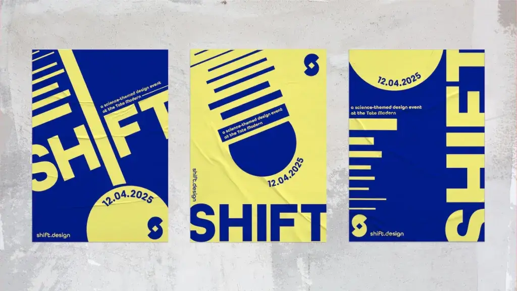
Shift – Two-Colour Branding

BRAND IDENTITY, BRIEFBOX BOOTCAMP Shift – Two-Colour Branding Created as part of the Briefbox bootcamp, this identity for a fictional science event at the Tate Modern was a challenge of simple shapes and a very limited colour palette, showcasing minimalism in design. Client Self-directed, Briefbox Medium Printed Advertisements Web Design Software Adobe Illustrator Adobe Photoshop […]