THE YOUTH HARBOUR - BRAND IDENTITY
Full identity for The Youth Harbour, an initiative launched by the Foundation for Environmental Stewardship (FES) in 2021. I created the overarching brand identity — logos, typography, colour palette, and brand guidelines. This informed the launch of the Youth Harbour's website.
The Harbour is a youth-for-youth platform focused on empowering youth to take climate action. While acting as the creative lead for the Foundation for Environmental Stewardship (FES), I was given the opportunity to brand out The Harbour from the ground up.
After discussion with the team, we decided on:
- needing a Canadian focus within the branding
- organic and natural, but still abstract
- vibrant, as to emphasize the youth-focus of the platform
Below, I further break down my process in creating the brand identity for The Harbour.
(For more information about it, please visit The Harbour's website!)
The Harbour is a youth-for-youth platform focused on empowering youth to take climate action. While acting as the creative lead for the Foundation for Environmental Stewardship (FES), I was given the opportunity to brand out The Harbour from the ground up.
After discussion with the team, we decided on:
- needing a Canadian focus within the branding
organic and natural, but still abstract
vibrant, as to emphasize the youth-focus of the platform
Below, I further break down my process in creating the brand identity for The Harbour.
(For more information about it, please visit The Harbour's website!)
The Harbour is a youth-for-youth platform focused on empowering youth to take climate action. While acting as the creative lead for the Foundation for Environmental Stewardship (FES), I was given the opportunity to brand out The Harbour from the ground up.
After discussion with the team, we decided on:
- needing a Canadian focus within the branding
- organic and natural, but still abstract
- vibrant, as to emphasize the youth-focus of the platform
Below, I further break down my process in creating the brand identity for The Harbour.
(For more information about it, please visit The Harbour's website!)
The Harbour is a youth-for-youth platform focused on empowering youth to take climate action. While acting as the creative lead for the Foundation for Environmental Stewardship (FES), I was given the opportunity to brand out The Harbour from the ground up.
After discussion with the team, we decided on:
- needing a Canadian focus within the branding
organic and natural, but still abstract
- vibrant, as to emphasize the youth-focus of the platform
- Below, I further break down my process in creating the brand identity for The Harbour.
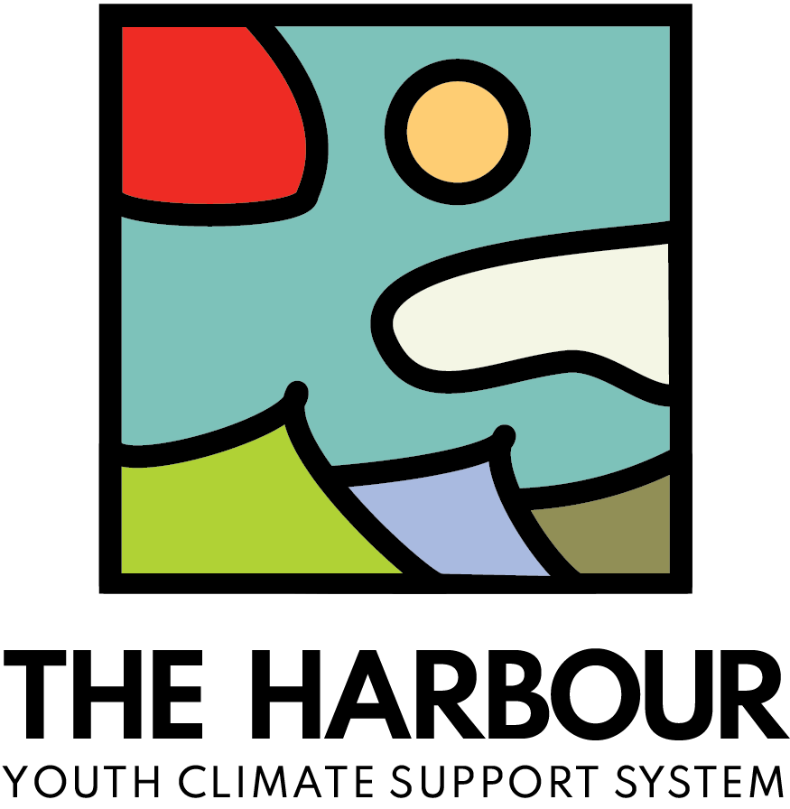
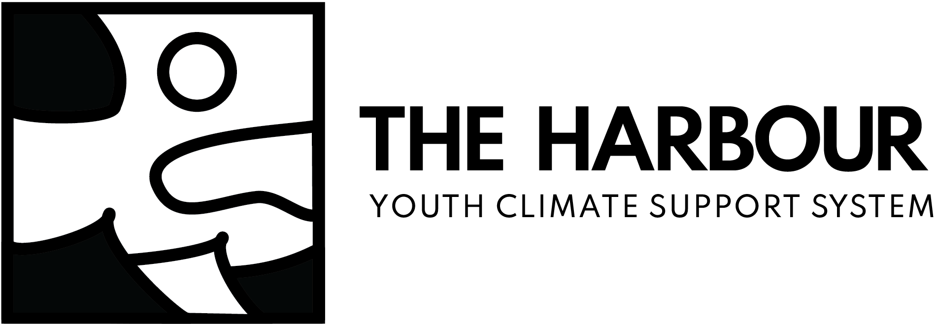
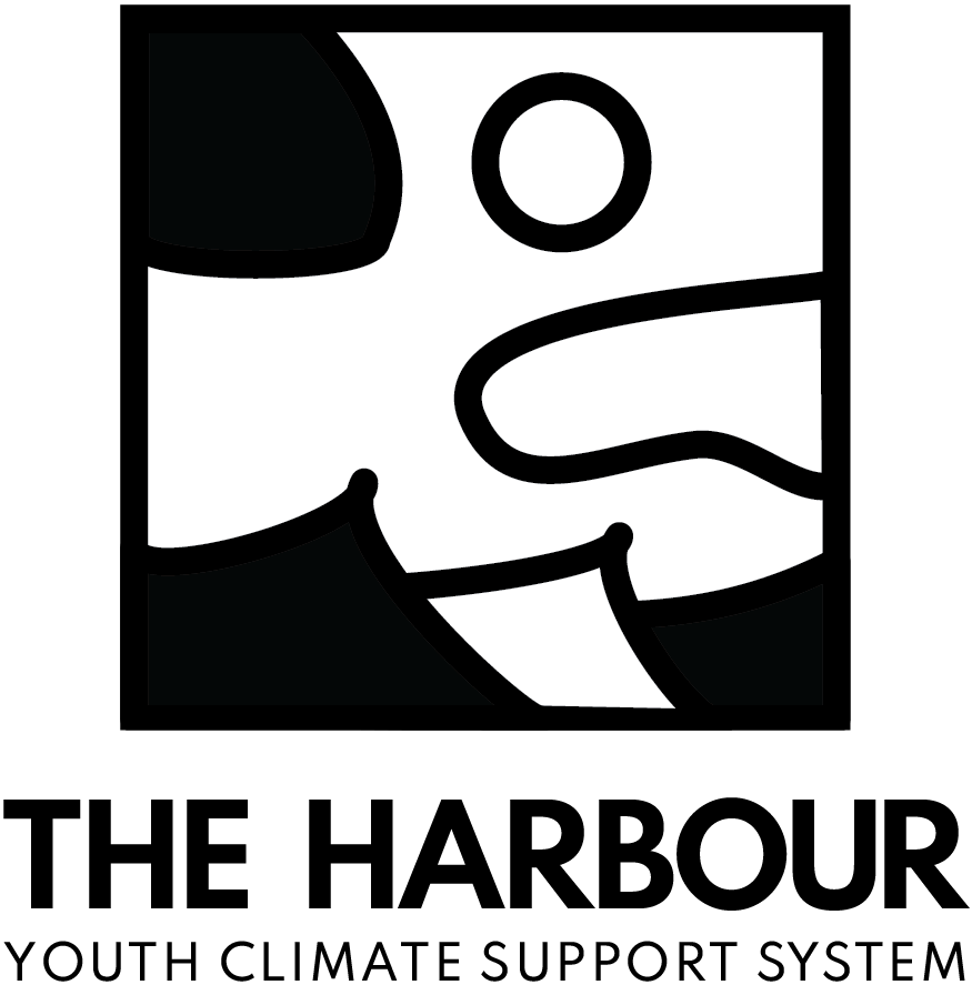
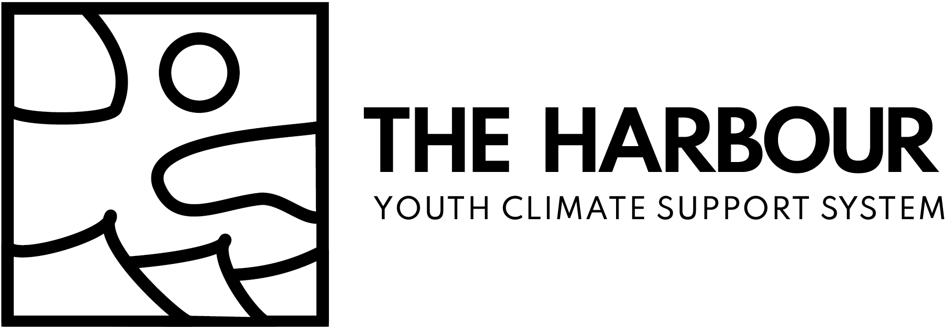
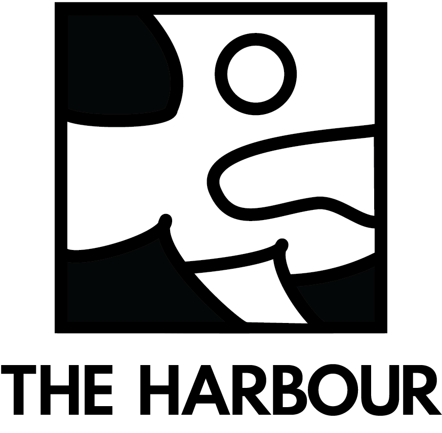
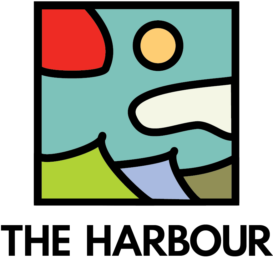
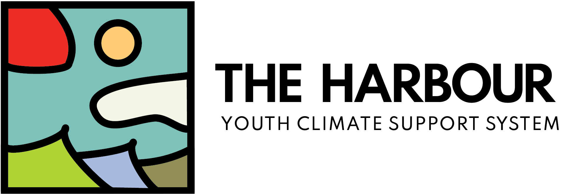
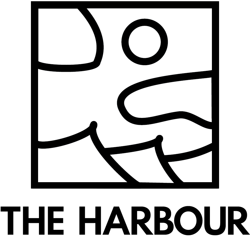
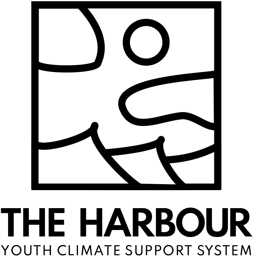
LOGO

Key focuses for overall look and feel: Canadian identity, organic and natural, vibrant and youthful.
COLOUR AND TYPE
Harbour Blue
Harbour Red
Harbour Lime
Lavender (Secondary Palette)
Sage Green (Secondary Palette)
Yellow (Secondary Palette)
Palette inspiration:
- bright, youthful, natural
- blooming flowers and sunny days
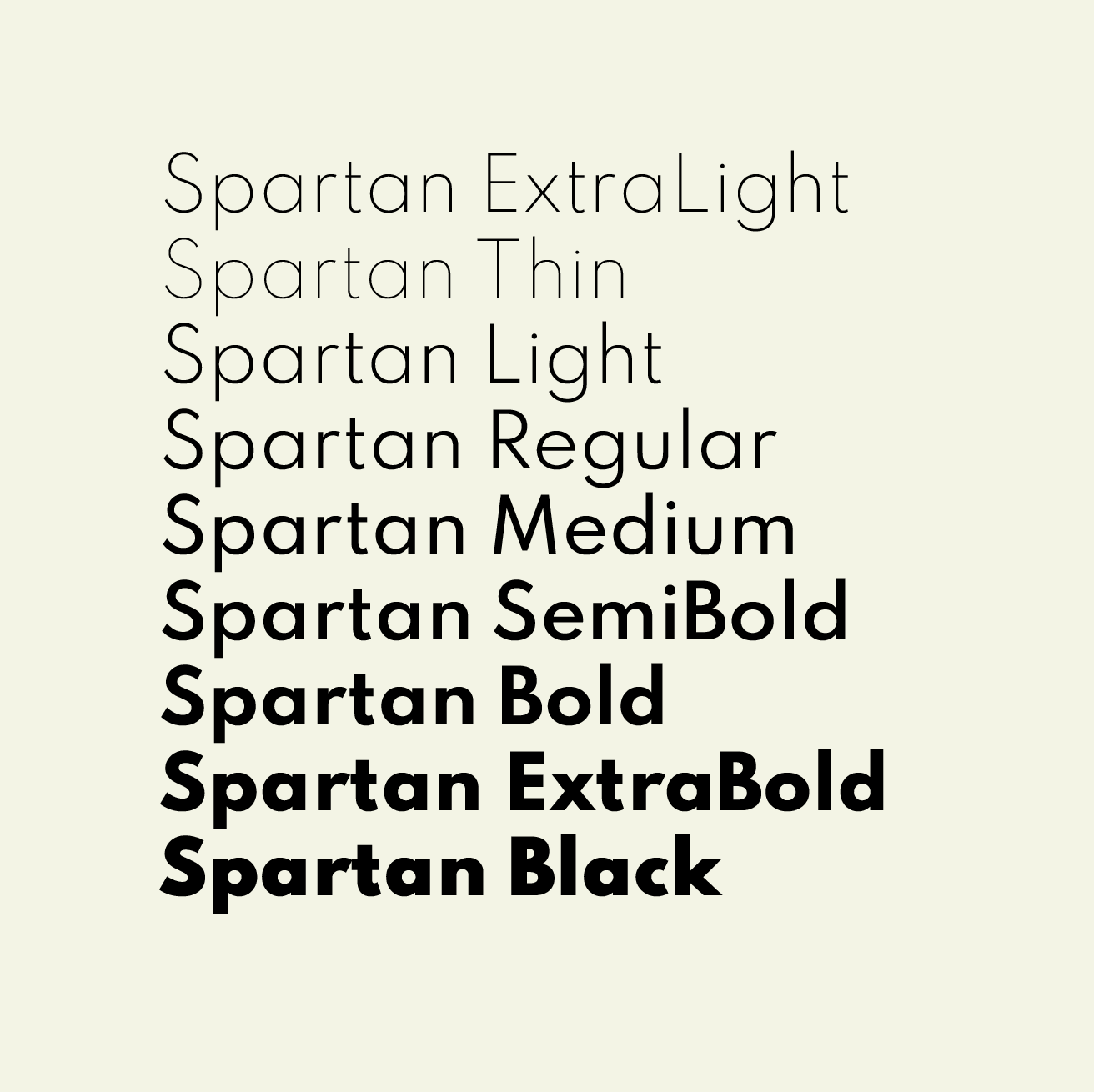
Spartan: diversity of weights for all copy, modern and elegant, complements the complexity of the icon
INSPIRATION
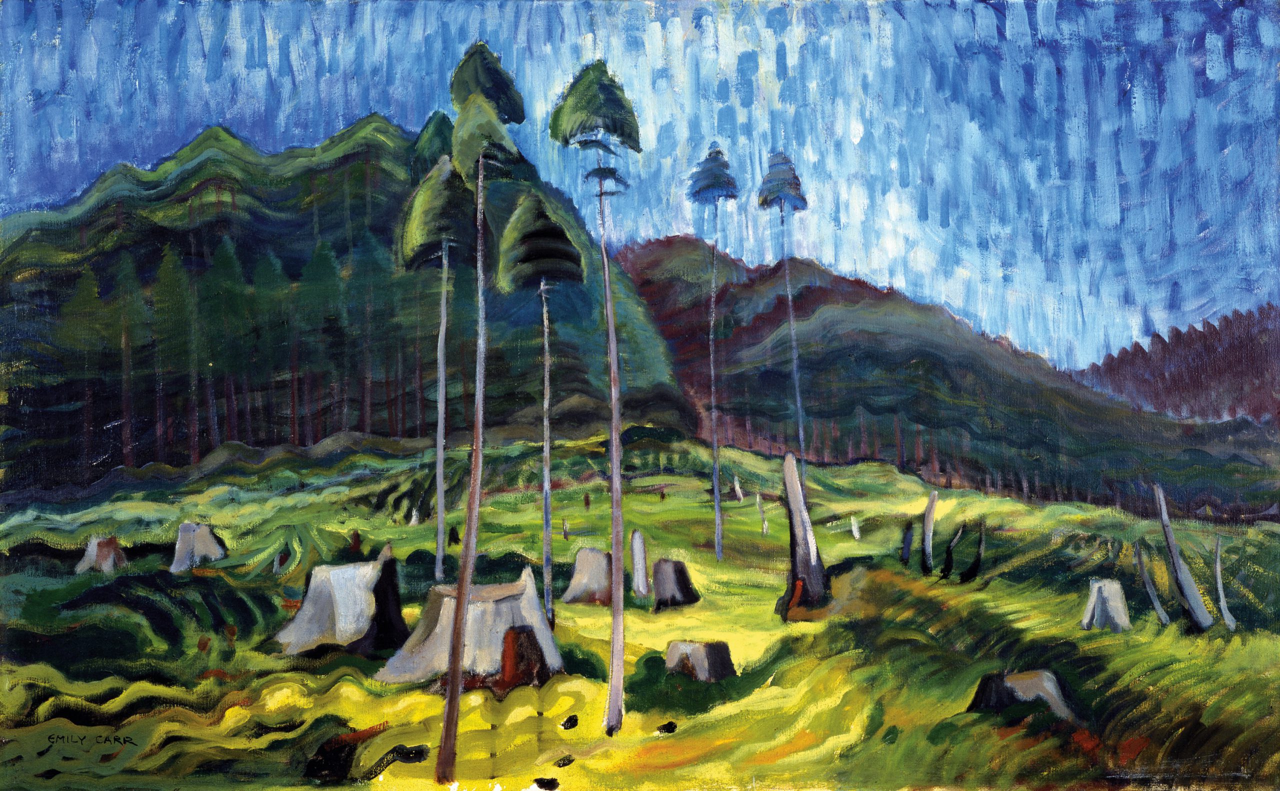
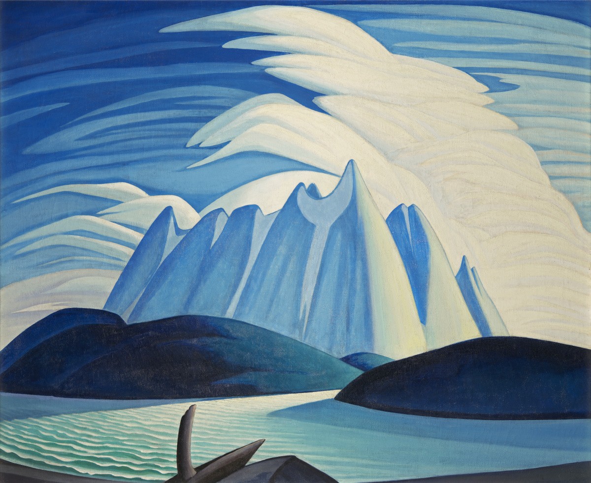
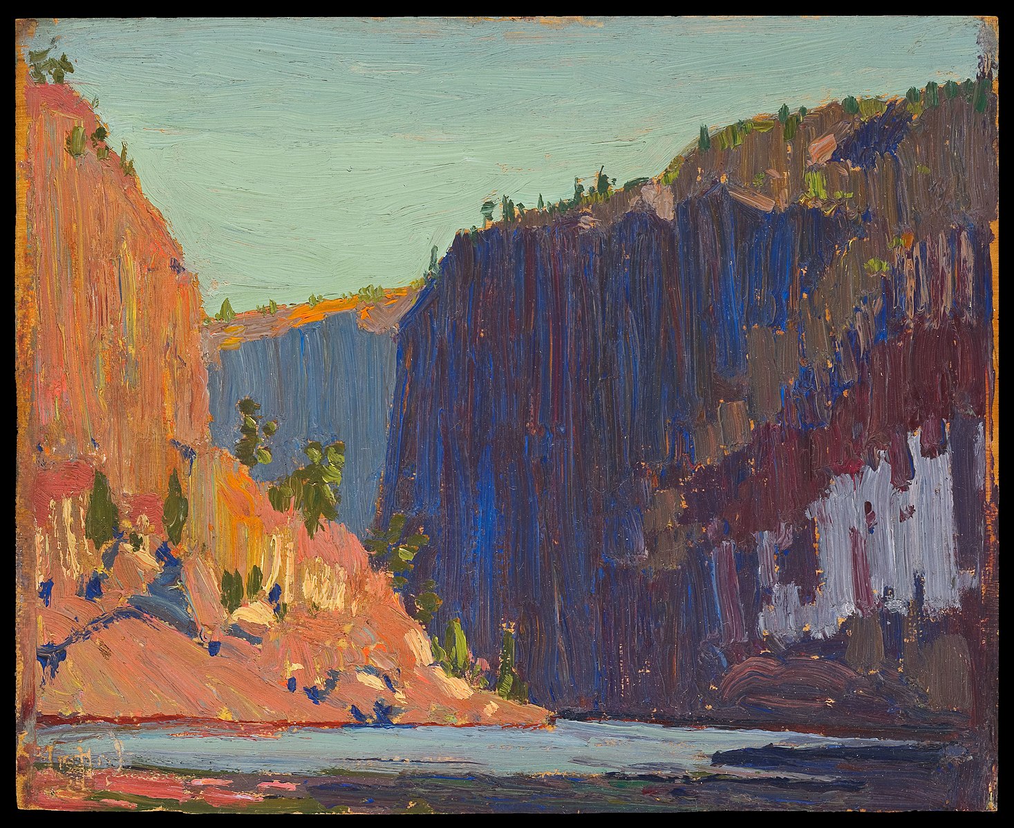
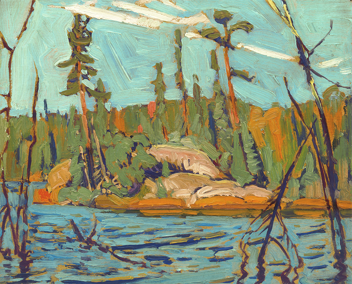
- Canadiana artists:
Tom Thomson, the Group of Seven, and Emily Carr
- abstract, natural imagery
- Canadian identity, with a distinct focus on climate
- vibrant youth focus
Collectively, we pulled a lot of inspiration from the works of the Group of Seven, and fellow artists Tom Thomson and Emily Carr. As celebrated Canadian painters, their works are easily recognizeable, vibrant, and use abstracted images to create a feeling of nature that we thought was fitting for the Harbour's identity.
Collectively, we pulled a lot of inspiration from the works of the Group of Seven, and fellow artists Tom Thomson and Emily Carr. As celebrated Canadian painters, their works are easily recognizeable, vibrant, and use abstracted images to create a feeling of nature that we thought was fitting for the Harbour's identity.
Collectively, we pulled a lot of inspiration from the works of the Group of Seven, and fellow artists Tom Thomson and Emily Carr. As celebrated Canadian painters, their works are easily recognizeable, vibrant, and use abstracted images to create a feeling of nature that we thought was fitting for the Harbour's identity.
Collectively, we pulled a lot of inspiration from the works of the Group of Seven, and fellow artists Tom Thomson and Emily Carr. As celebrated Canadian painters, their works are easily recognizeable, vibrant, and use abstracted images to create a feeling of nature that we thought was fitting for the Harbour's identity.
PROCESS
- contained logo, symbolizing a "stamp of approval" for eco/non-profit partnerships
- emphasize abstract but natural shapes and forms within

LOGOS